Analysis of Trading
5A.Fundamental analysis:
Fundamental analysis involves research and analysis on the true value or fair pricing of the company. This can be done through various methods such as financial statement analysis, macroeconomic analysis, comparing the earnings and valuation with its peers and other economic conditions.
-
Ratio Analysis:
Ratio analysis is a key part of fundamental analysis.This consists of carefully analyzing the company’s income statement and balance sheet to check the company’s profitability, liquidity and efficiency.
● Profitability ratios:
This consists of ratios that help determine profits the company can generate from its assets and day to day operations. Some examples are: Return on equity, profit margin percentage and Return on Assets Ratio.
● Solvency ratios:
This involves analyzing how the company’s debt and assets align to determine whether the company is solvent, will continue to be and under what given circumstances. Some Examples are: Debt-equity ratio and interest coverage ratio.
● Liquidity ratios:
These ratios help determine how quickly the company can pay off its debts using its existing assets. For Example: Quick ratio and working capital ratio.
● Efficiency ratios:
It consists of ratios that help analyze how effectively the company can use its assets and liabilities for revenue generation and profitability. For example: Inventory turnover ratio.
● Market prospect ratios:
This helps an investor get insights into the future earnings of the company and dividends that can be expected in the future. For example: Earnings per share and dividend yield.
5B. Macro economic events that affect the financial markets:
-
Interest rate decision:
This affects the financial markets if the investor expects interest rates to rise in the future, there will be a fear of investing in equities due to chances of reduced earnings and declined economic growth. Hence, an inverse relation is observed between interest rates and financial markets.
-
Stock Earnings:
The stock earnings have a direct relationship with its prices as that is the prime decision making information for an investor to make their decisions. The forecast of the earnings also helps the investor make a decision and the stock price might fall if the earnings are below the forecast.
-
GDP data:
GDP data affects the investor’s outlook on the country’s growth, inflation and consumer confidence. If the GDP data estimate is good, the markets will experience a rise and vice versa.
-
Non-farm payrolls:
A good report about job data will have a positive outlook on the economic growth opportunities.It can eventually lead to increased money supply to the financial markets as the participation in the market will improve.. If the report is weak, the investors will be concerned and stock prices might decline.
-
Inflation Rate:
Inflation affects the markets as the investor fears rising prices can lower the demand for products and will impact the company’s profitability and overall market.
 The inflation rate in Argentina since 2022 has touched a rate of 102% which means
that the prices of all goods have more than doubled since the past year.
The inflation rate in Argentina since 2022 has touched a rate of 102% which means
that the prices of all goods have more than doubled since the past year.
5C.Technical analysis:
Technical analysis is the study of historical data to forecast and predict future
patterns. It uses price, charts, indicators and other data patterns to understand the short term and long term
market trends.
The following technical terms are necessary for technical analysis.
●Open:
The opening price is the price at which an instrument starts its trading at the start of any given time period, such as a day, a week, or a month.
● Close:
The closing price is the last trading price of an instrument by the end of a given time period.
● High:
The high price is the highest price that an instrument traded at during a given time period.
● Low:
The low price is the lowest price that an instrument traded at during a given time period.
-
Different kinds of Charts:
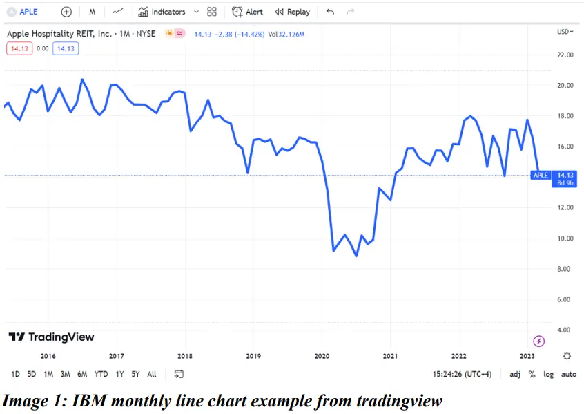
● Line Chart:
A line chart uses only one price either the open price or close price, to connect a line depicting a clear trend. This is useful to analyze long term trends and makes it easy to identify the other patterns with clear support and resistance.
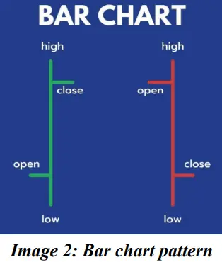
● Bar Chart:
Bar charts use OHLC- Opening, high, low and closing prices to create bars on the chart based on the time frame. It shows all the essential information for trading.

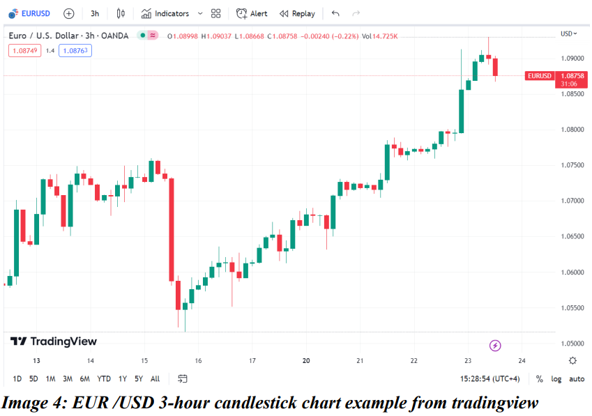
● Candlestick Chart:
Candlestick chart is similar to a bar chart but there is a difference in the visual representation of the price movements. The bar chart simply marks open, close, high and low on the same bar but candlesticks distinguish the open and close using the thick ‘body’ and high and low using thin ‘wicks / shadows’.
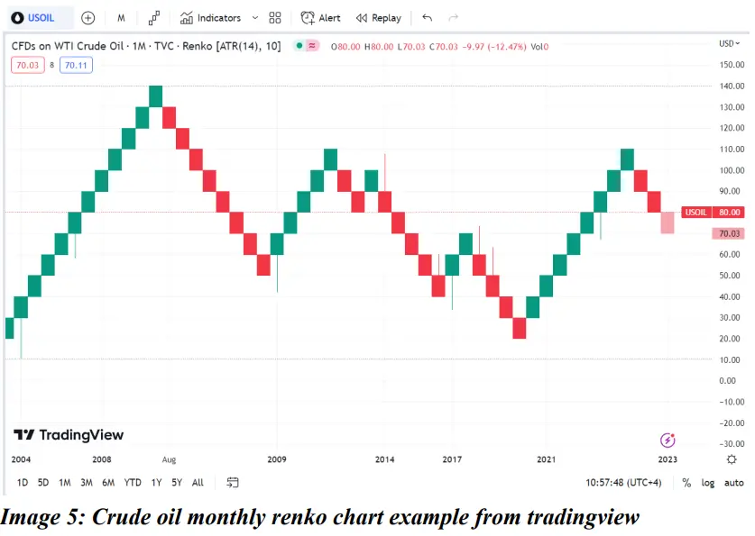
●Renko:
Renko charts are based on price movements unlike time frames in most charts. The bar-like formations are called bricks and renga in Japanese. A new brick is formed when the price moves by a specified amount (ie) the box size.
● Equivolume:
An equivolume chart shows high and low prices for the time frame along with the volume. The length of the bar shows high and low and the breadth shows volume. This makes it easier to receive confirmation for chart patterns along with volume.
-
Candlestick patterns:
Candlesticks patterns are the most commonly used technical analysis tool to track asset’s price movement. It can be observed in various time frames like monthly, weekly, daily, hourly or even minutes and seconds. It has three basic features:
● Bodyrepresents the open-to-close range.
● Wick or shadowindicates the high and low.
●Color reveals the direction of market movement. A green body indicates a price increase, while a red body shows a price decrease.
There are two types of candlestick patterns as below:
●Bearish candle:
It has a closing price lesser than the opening price. It is represented in red color. It indicates that the sellers are in control and price would be pushed further down, so it provides an opportunity to sell or enter a short position.
●Bullish candle:
It has a closing price higher than the opening price. It is represented in green color. It indicates that the buyers are in control and price would be pushed further up, so it provides an opportunity to buy or enter a long position.

● Single Candlestick patterns:
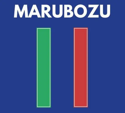
❖ Marubozu:
Marubozu is a candlestick pattern with a long body and almost no or very little shadow. This strong momentum candle indicates the strength of the trend and helps provide confirmation.
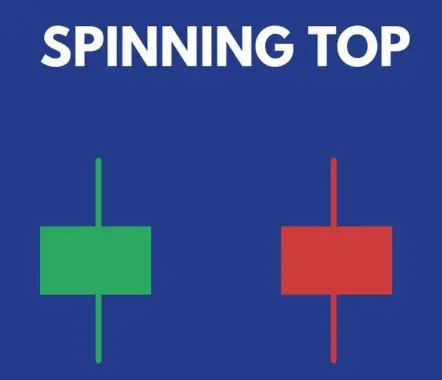
❖ Spinning top:
Spinning top is a candle with long upper and lower shadows but a small body. It shows an indecisive trend and could be in a consolidation.
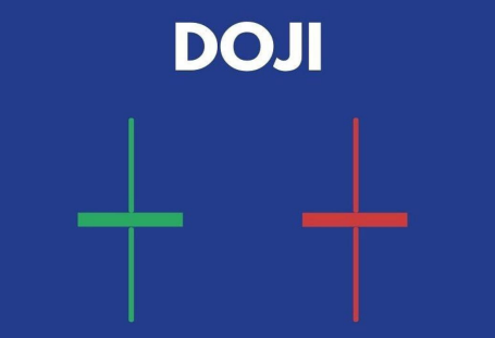
❖ Doji:
A doji is similar to the spinning top pattern but a doji does not have a body and only long upper and lower shadows. It also indicates uncertainty and is also used in other multiple candlestick patterns such as morning and evening stars.
❖Hammer:
A hammer candle has a small body with a big lower shadow. This usually appears in a downtrend and might indicate bullish reversal with good momentum. Color of the candle is irrelevant.

❖ Hanging man:
A hanging man candle is a small body with a big lower shadow. This candle appears in an uptrend and might show bearish reversal when combined with good volume. Color is irrelevant.

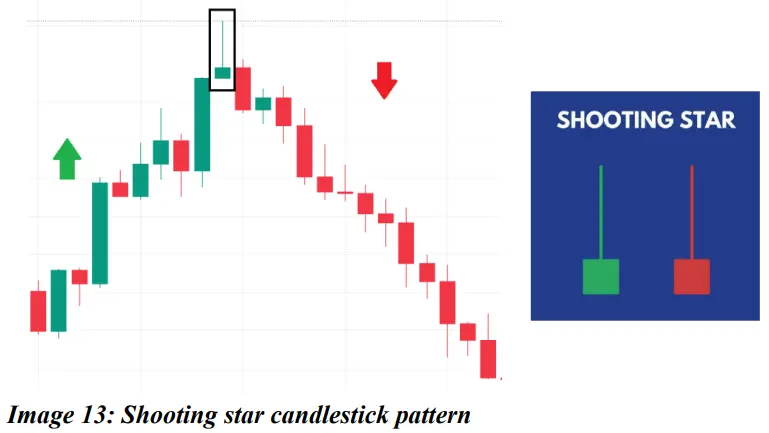
❖ Shooting star:
A shooting star is a candle with a small body and a long shadow on top and a very little or no shadow on the bottom side of the candle. It is usually formed in an existing uptrend and indicates a downside reversal. The color of the candle is irrelevant.
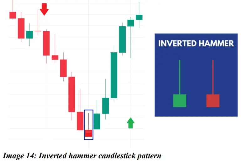
❖ Inverted hammer:
An inverted hammer star is a candle with a small body and a long shadow on top and a very little or no shadow on the bottom side of the candle. It is usually formed in an existing downtrend and indicates an upside reversal. Color is irrelevant.
● Multiple candlestick patterns:
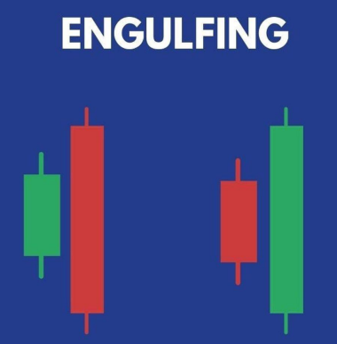
❖ Engulfing pattern:
This pattern consists of two candles, the first one being a candle with a small body followed by a candle of the other color with a body larger in a way that it engulfs the previous candle. This indicates that the momentum is now stronger toward the opposite trend.
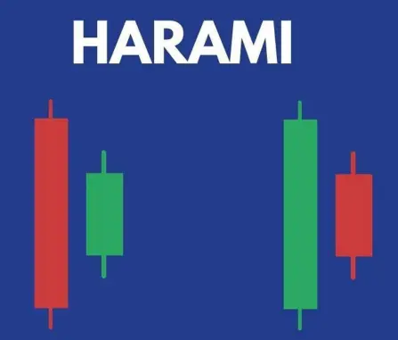
❖ Harami pattern:
This pattern is the opposite of the engulfing pattern. The larger candle appears first on the chart followed by a smaller body candle. It helps show reversal in trend especially if there is a support, resistance or a trendline.
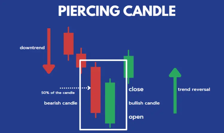
❖ Piercing candlestick pattern:
A piercing pattern occurs at the bottom of a downtrend and consists of a bullish and bearish candle. The first candle is bearish followed by a bullish candle that opens lower than the previous candle and closes between the body of the previous candle. This pattern indicates trend reversal to the upside.
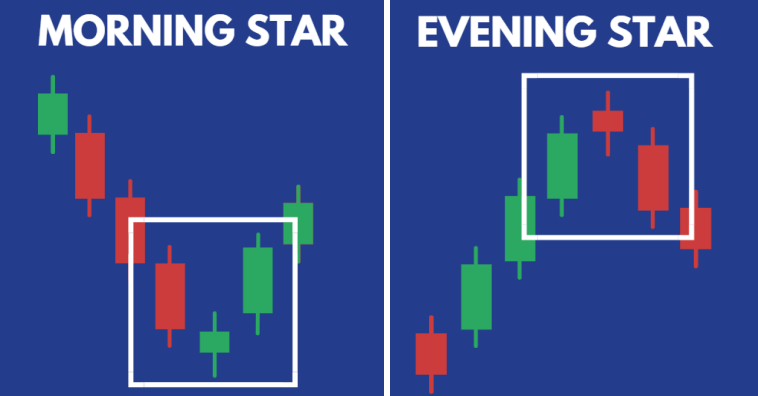
❖ Morning and evening star:
A morning star consists of three candles which are one bearish candle, a doji and a bullish candle. It usually occurs in a downtrend and the pattern is a good confirmation for reversal of trend. Similarly an evening star consists of a bullish candle, doji and a bearish candle. This appears during an uptrend and indicates trend reversal to a downtrend.
-
Price action:
Ratio analysis is a key part of fundamental analysis.This consists of carefully analyzing the company’s income statement and balance sheet to check the company’s profitability, liquidity and efficiency.
●Support and resistance:
Support and resistance are one of the key concepts of technical analysis. Support is when in a downtrend the price tends to move up from a certain level. When it moves up twice or more times from the same level it shows a good support or reversal point for price. Once support breaks, the same point acts as resistance on the chart. Similarly, in an uptrend when price constantly faces a hurdle or is not able to cross a level and reverses twice or more it is called resistance. Once resistance is broken, the same level acts as support on the chart.
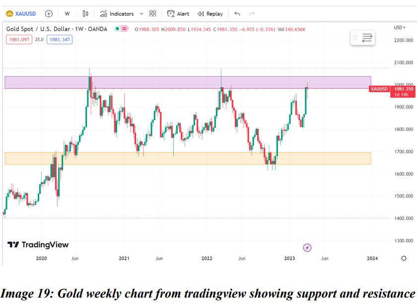
On the weekly chart of gold (XAU/USD) above, a prior resistance level (yellow shaded area) became the support level, resulting in a strong rebound. The psychological level has previously acted as resistance. (purple shaded area).
● Trendlines:
Trendlines are lines drawn on charts that connect a minimum of two or more points to form a support or resistance level on charts. A channel is created when two trendlines can be drawn and move parallel to each other. They also help analyze long term trends and identify swing highs or lows.
The below weekly chart of Oracle (ORCL) shows a channel indicating a clear uptrend. When the channel (blue shaded area) was broken on the upside, the ascending trendline (green) acts as a support.

● Fibonacci retracement:
Fibonacci retracement is used in technical analysis to show levels where could take support or resistance and retrace. This is shown by drawing a line between two points on the chart, ideally the peak and trough that generates lines to show retracement of price.
Some of the important Fibonnaci ratios used are 23.6%, 38.2%, 61.8% and 78.6%. Fibonacci retracements are better when used with other indicators such as trendlines, volume and moving averages.
Refer below example of AUD/CAD in daily chart to see various levels differentiated by color codes. We can see a major bounce back or retracement level at 0.5 (0.90633). The next major resistance is at 0.236 (0.93004) level.

-
Indicators:
Indicators are formed through mathematically calculated formulas using historical prices to identify changes in trend, stop loss and targets.
●Relative Strength Index:
This is a momentum indicator developed by J.Welles Wilder. It moves between 0 and 100. Usually when it crosses the level of 70, it is considered overbought, when it is below 30 it is oversold. The indicator also shows divergences between candlesticks and RSI indicator. It shows reversal at early stages of the trend.
● Moving Averages:
It is an indicator calculated using average prices of a specific data set based on the time period used. For example, while using only the daily chart, a 30 day MA will be calculated for the current day using the average price of the past 30 days. There are various types of moving averages such as simple, exponential and weighted moving averages. The crossover of two averages is often used to identify change in trend. A crossover where 50 MA crosses 200 MA is called golden crossover and indicates an uptrend. If 50 MA crosses below 200 MA it is called a death crossover.
●Volume:
Stock prices do always show an accurate picture to analyze the trend and hence we use other indicators to get a confirmation on the trend. One of the best indicators used for this is volume. It shows how strong the conviction of the traders is in the direction of the trend. Volume can also be used to find divergences with price and capture an early reversal in trend. Some of the most used indicators for Volume analysis are: On-balance volume, Chaikin money flow and Volume RSI.
●MACD:
The Moving Average convergence/divergence is calculated as the difference between 12 and 26 EMA. There is also a 9 EMA line which is known as the signal line. Similar to the RSI, the MACD also indicates overbought and oversold zones.
-
Trend analysis using price action and indicators:
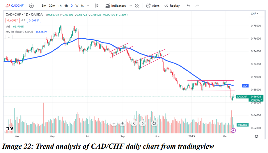
In the above chart of CADCHF on a daily time frame, it is seen that CADCHF was in an uptrend from Jan 2022 to Mid of June 2022. By the end of June, it broke the 50 days moving average and went in a downtrend. Since then, it has continued to take resistance from the 50 day moving average. Additionally, It has also formed a reverse flag pattern and confirmed the downtrend. The same pattern has repeated in September, November and then in March 2023.
FAQ
Got some questions? We're here to help!
You're being redirected to another page, it may takes upto 3 seconds